Sofar Sounds Website
Sofar Sounds is a global music community that connects artists and audiences through live music. Located in 400 cities around the world, Sofar Sounds curates unique, intimate concerts. Each concert includes three surprise artists in a secret location that’s revealed just 36 hours before the event.
The Details
About the Project
The current search bar for Sofar Sounds concerts is very limited with a single dropdown menu. The focus of this case study was to research and design a better search experience for new users in order to increase bookings.
Timeline
5 weeks
Role
User Research
Product Strategy
UX Design
UI Design
Prototyping
Tools
Figma
Figjam
Dovetail

UX Challenges
With no guidance as to what should specifically be searched, the current Sofar Sounds search bar creates a confusing and frustrating experience for the user. Its lack of organization and specificity makes it difficult for users to not only understand what they should be looking for, but what a Sofar Sounds event offers in general. Our goal was to make it easier and faster for users to understand the Sofar Sounds experience, find local events, and purchase a ticket in order to increase bookings..

UX Solutions
To solve our UX challenges, my team and I focused on creating a detailed search bar that indicates users can only search for locations and dates instead of specific artists. Based on the findings from our user research, we also included more relevant filter options and designed an overall more simple and straightforward user experience.
Initial Observations
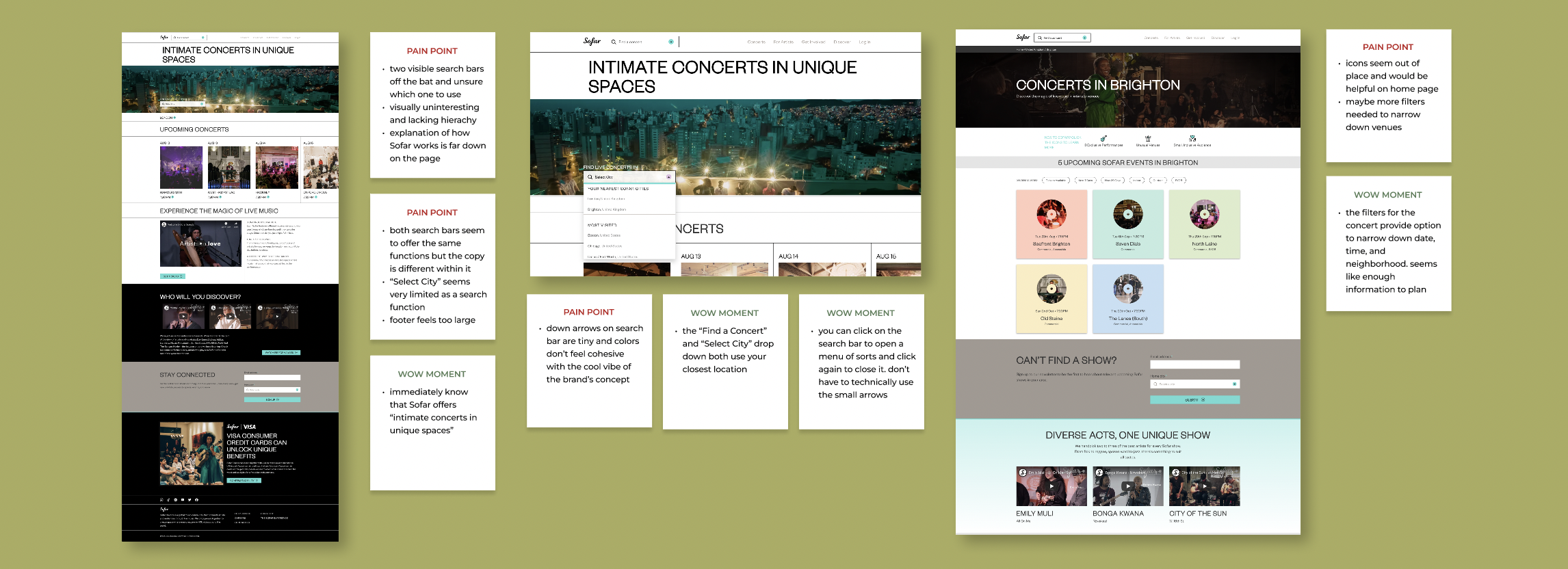
Based on our usability review, we found the website’s lack of hierarchy to be rather confusing. There are currently two search bars, one located in the nav bar and one on the hero image of the home page. Both search bars are approximately the same size and while one prompts the user to search a city, the other prompts them to “find a concert”. We were unclear as to which search feature should be utilized and what exactly we should be looking for. We also discovered pain points with the UI design. Some buttons, such as the arrow on the search bar, are extremely tiny and we found that the website’s overall color scheme lacks impact. Lastly, while we found the current filter options for concerts to be useful, we thought there could be additional filters added that would help users narrow down their search.
Competitive Analysis
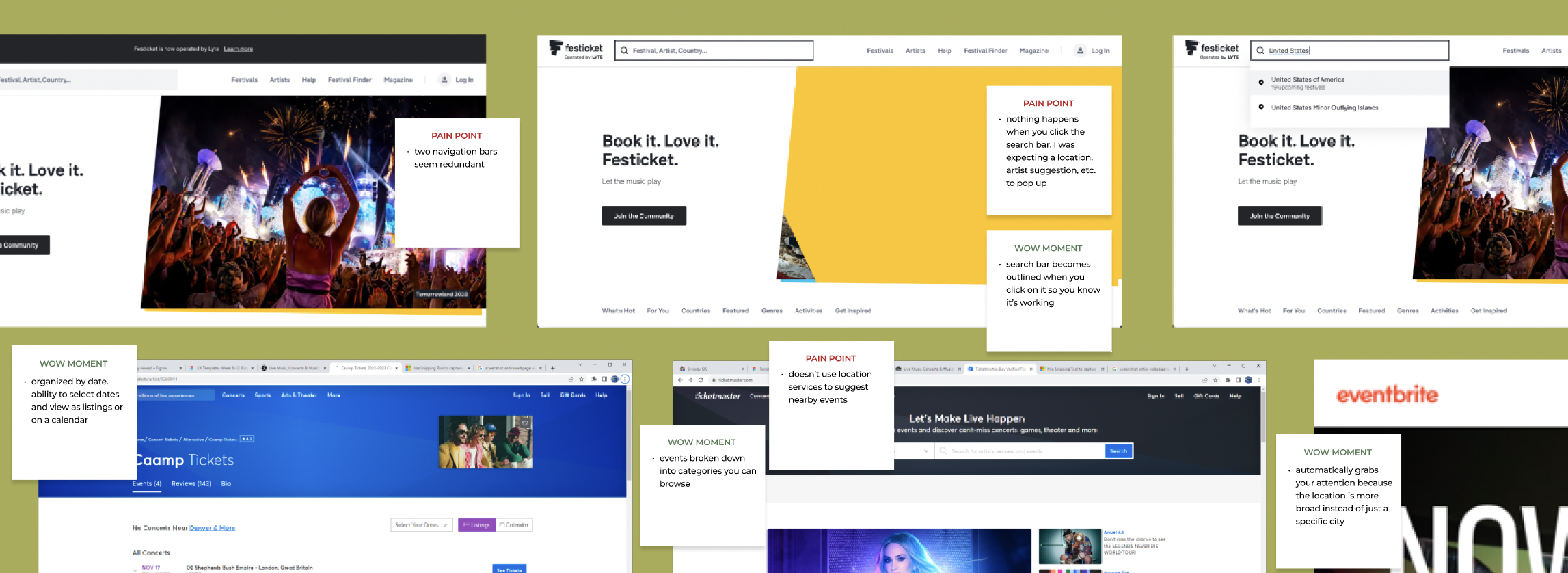
To better understand the current market, I performed a competitive analysis on Ticketmaster, Eventbrite, and Festicket. I focused my attention on the overall experience and specifically their search function. I analyzed how effective and pleasant their interface experience was, determined our key learnings, and applied them to my own redesign.

Interviews &
Affinity Mapping
To gain a better understanding of users’ experiences searching for and attending concerts, we each conducted research interviews. We then took our findings and created a tagging taxonomy that we synthesized in Dovetail to analyze and understand our data. I immediately found that users search for specific artists when looking for a concert to attend. They generally stick to local concerts, enjoy both large and small venues depending on the artist, and like having the option to sit or stand. I also found that it is extremely important for them to bring their own food and drink or have the ability to purchase it from the venue.
Informational
Architecture
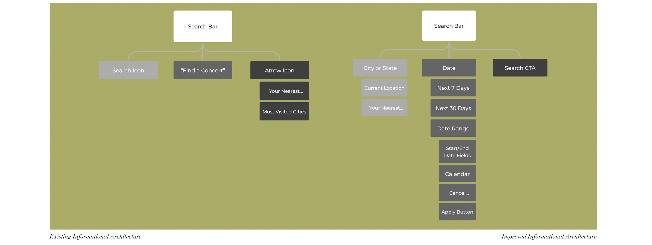
I mapped out the existing informational architecture of the website and, specifically, the search function, to uncover any pain points in navigating the product. I used the findings from our research to improve this informational architecture and create a better search experience.


User Flow
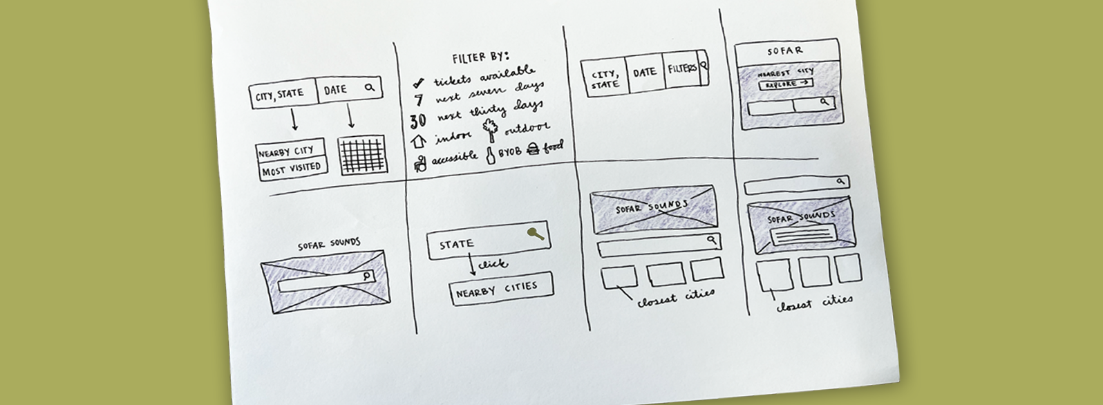
The existing user flow presented challenges such as a dead end if you decide not to purchase a ticket and too many options to select a city. My goal with the new user flow was to allow the user to enjoy a smooth search experience with the ability to easily move both forward and backward from page to page.
Wireframes
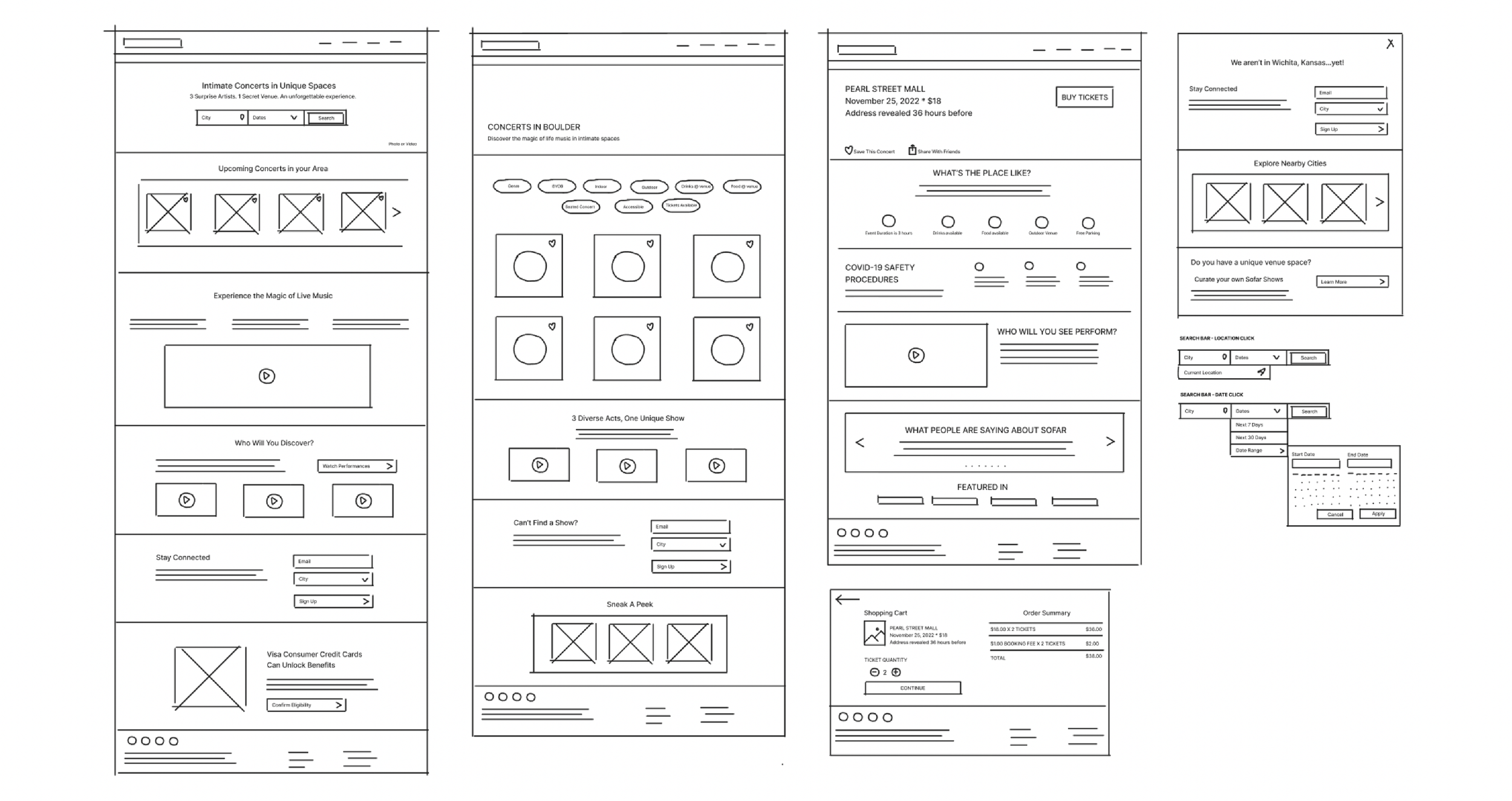
Figjam allowed us to map out our wireframes to understand the design and flow at its most basic design level. Our goal here was to focus on simplicity and a strong sense of hierarchy.

High Fidelity Prototype
To view the final prototype, click here.
